Saturday, 29 September 2012

Graphics Week


At the start of Graphics week I was a bit unsure about what we were doing, however we were all told to "just go with it", doing so meant that I started to get my head around the idea of what we were doing. On monday we had theory for the first part of the day where we discussed what graphic design actually is. It is a broad term that encompasses many disciplines such as: Editorial Design, Promotional Design, Web Design, Advertising Design, Branding Design and Corporate Design.
 
The photo above is the work that I created in the afternoon when we were discovering the importance of drawing in Graphic Design. Drawing in this aspect of art can help by creating designs and developing these further through further sketching. We did some quick thumbnail sketches of text that could be found on everyday objects, we did six on each object so that we had a range to choose from in the next process. The photo above is the work I created through being taught different ways of drawing, we folded an A2 piece of paper into four to create four A4 sections. Next I created backgrounds for the paper sections, two through using collage, and two by using ink. Then I chose the best thumbnail sketch for each object's text and then we all used the same media techniques to create the four sections. The top left rectangle was done in ink and was drawn with a stick at arms length, I found this surprisingly easy to do. The top right rectangle was created by drawing in our none writing hand, this was very difficult and doesn't look very good at all. The bottom left was created by not taking the graphite pencil off the page while drawing. Finally the last one was done by creating the letters out of masking tape, then applying shoe polish to the rectangle and then removing the masking tape. This exercise helped me to understand that drawing doesn't have to be the same all the time.
 
The other four photos are the finished pieces for this weeks major project. We were given seven words and had to create mind maps on each of these seven words. In reference to earlier in the week we then had to create six thumbnails of each word and write the word in each thumbnail in some way which associated itself with the word. The next task was to create backgrounds that also reflected each word, we created two different styles of backgrounds for each word. We then picked our favourite background for just four of the words and photocopied these several times so that we could experiment and try out our different font styles. When we had decided on the font and positioning we wanted we then scanned in our background images into the computer and uploaded them onto photoshop. From there we then created our fonts for each word and applied them to the backgrounds, the resulting images are what you can see above.


Life Drawing 28/09/12


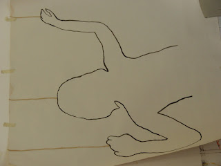
During this weeks sessions of life drawing we were given several different poses. During the past two weeks the positions I have had to draw have just been standard standing and sitting poses. At first I thought that it would be harder if the models were to be in more complicated positions, however I did find some of them easier than others. For example the photo above is the first complex position I did and I was surprised at how well it turned out, the only thing wrong with it that I could see was that I have got the positioning of the left arm wrong. To correct this, first I should have draw the figure so that they were higher up on the page, that would have enabled me to get in the arm properly. When looking closer at the figure I realised that the left elbow should be in line with the left ankle. I enjoyed drawing these positions a lot more than the standard standing and sitting positions, they were a lot more challenging and required more observing angles and referencing to body parts.

Friday, 28 September 2012

Creative Review July 2012 - Enduring Characters


After being told about typography in our Graphic's week theory session, I decided to find out more about it and what it actually involved. I found this article in Creative Review and found that it went into a lot more detail and described the different ways in which typography can be used. I found it interesting that they're different types of typography, ornamental and practical. Ornamental types are used mainly for decorative purposes, they usually have certain styles to express such as a time of year or an object or being such as animals or plants. These types were mainly used in the previous centuries and since then technology has progressed. We now have digital type which can be used for practical reasons as well as ornamental ones, such as sign useage of hazard warnings by Linotype's Warning Pi. Even though now typography can be done digitally, it still takes a lot of time, patience and skill to perfect.

Wednesday, 26 September 2012

Personal Six Graphic Designers

 This first piece of graphic design is created by artist and designer, Jamie Reid, he is considered to be the graphical voice of British punk. I like his work as it daring and out of the ordinary. For example in this piece, even though it is a picture of the Queen with typography over her eyes and mouth and creates a piece that almost makes you not want to look at it, the viewer is still drawn in to observe the piece whether they want to or not, this is perhaps why it was so successful as the cd cover for the Sex Pistols.
 This piece of artwork is created by graphic designer Ed Fella. I really appreciate his use of colour and I think that this makes his work very captivating for the viewer. When I first looked at this piece of artwork I just wanted to keep observing it more and more. This is definitely to do with the colours used and the way they are used such as the complex blending. However the captivation it creates I feel also has something to do with the composition and the way in which the letters are written. They are quite flowing and free, and this is also reflected effectively in the colours used too.
 The third piece of artwork is created by the fine artist Edward McKnight Kauffer who designed posters for airlines. I really like the thought that has gone into this piece, one can really appreciate what the designer has been thinking about. For example the colours, composition and typography have clearly all been thought about very carefully. It creates calm and welcoming feelings to San Francisco and the text American Airlines at the top appear italic, as though the text is on a journey too.
 This fourth piece of artwork is created by Alphonse Mucha, one of the most important painters of French Art Nouveau. I have always liked and appreciated Mucha's artwork. This is because of one the aspects in which he makes his work his own, this being the fact that he uses a thin black or brown outline around the whole image. This draws the viewer in and I also feel that it separates the foreground happenings to the background ones. This needs to be the case in graphic design, as if all aspects of the piece are all the boldest and brightest, the viewer does not know where to look first and is therefore most likely to be put off by it.
 This fifth piece of work is by Otl Aicher and is good at creating graphic design to use in visual communication. He is probally best known for designing the pictograms for the 1972 Munich Olympic Games which can be seen above. I like this work as it is designed to catch the eye, however is also simple and understandable which was a very important aspect when designing for an Olympic Games as one has to be sure that everyone else can understand your design.
Finally the sixth piece of graphic design work was created by Pentagram. The company have a wide range of clients and design success, creating work for companies such as Penguin, British Airways and Kodak. I like the above piece created by Pentagram as it is plain and simple but effective and to the point, most people have heard of penguin books.

Tuesday, 25 September 2012

Reflection on tutor's choice of Graphic Designers

The piece of work above is created by graphic designer Alan Fletcher. I find this piece of artwork very intriguing as he has created the word out of the media describing it. I also find this piece effective as he has used collaged letters but very effectively. I think that the danger with this piece of work was that it could have ended up looking like a ransom letter from a criminal, however this clearly does not and I feel has a certain class and edge about it.
This second piece of artwork is created by Kris Sowersby. The effects that I like about this piece are that they have used both images and text to create the phrase "I Do" I like this because it requires the viewer to observe the creative work deeper and longer, instead of the message behind the graphic design being totally obvious to everyone. Another aspect that I like about this piece of artwork is the choice of colour. The three colours used work in sync very well together, the black and white correspond extremely well together and the blue is a calm subtle shade which goes well with the intensity of the black.
The third piece of artwork is by Noma Bar and one of the things that I like about their work are the vibrant, bold and bright colours. They all seem to compliment eachother well and their composition of colour also helps this greatly. Another aspect of this graphic design that I like is the idea of creating two images within one. This will appeal to different people as some will see the island and hand first then the parrot. This is effective as it requires the viewer to think about what they are looking at rather than just knowing what it is immediately.
The fourth piece of artwork is created by graphic designer Pep Carrio. In this artwork I find the scale quite over powering but I do not think that that is necessarily a bad aspect of the piece. The small figure outline helps to give this illusion of the huge scale. This piece of artwork also creates thoughts and feelings in me, for example the pattern surrounding the figure makes me think that they are confused or trapped, it plays with your emotions and thoughts and that is why I like it.
The fifth piece of artwork is created by graphic designer Wim Crouwel. This work has a quite boyish style that does not appeal to me much, however the use of simple shapes, slightly different texts and the complimenting colour scheme work well together to create posters that catch the eye, such as this one.
The final piece of artwork is created by the graphic designer Stefan Sagmeister. I find his slogans quite pessimistic, however I really like his use of text, especially in this piece of artwork as the words are designed so that they fit into the background image too. In this case being branches off a tree. The placement of this piece I think would also have an effect on the world around it as it is placed above a shop, I think the slogan would definitely encourage people to buy things now and not in the future.

Design Museum Andrew Blauvelt Exhibitor

The Design Museum in London regard themselves very important for the continuing of design as a whole. They feel that better design will result in a better future. They also see design as an aspect of everyday life and a means to make the world a better place. The museum celebrates the work of some of the best designers in the world. One of these artists is the graphic designer Andrew Blauvelt. He is regarded as one of the most influential people in the American graphic design field, as an actual designer but also as a director in which he commissions creative works. He is the design director of the Walker Art Centre in Minneapolis. I find his work to be very captivating and bold. He is very good at using creative composition that creates an impact however is not too over powering to the viewer. In this piece he has also used lots of colours but the viewer still manages to process all of the creative sections. This is a useful skill as if the composition was to be too bold, with each different part "screaming" at you as it were, then the images would be too hard to process. I imagine that this is a hard task to do and requires a lot of work and time, however the effect is something amazing.

Sunday, 23 September 2012

Applied Arts Week


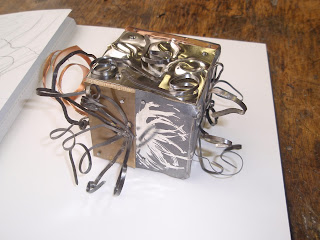
Over the applied arts week I have explored observing objects and creating new beings from source materials and other objects. For example on monday I created drawings of both organic and man made objects, I then overlapped these and asked my partner to observe my drawings and find shapes and positioning that they liked. From this information I then began to design and draw jewellery from these shapes. I have also made my own creations in ceramics last friday, out of terracota clay and heavily grogged terracota clay. The latter of these is used for sculptor. It has a more gravely, sandy texture as it has smashed clay pieces in it. This combination makes it a lot stronger than plain terracota clay. Last thursday I did metalwork with Mark, I was a bit nervous about attempting silversmithing as I had never done anything like it before. However the day was very enjoyable and a good experience, in which I learnt many skills and techniques. I also did some research into a current silversmither, Kayo Saito, along with some small sketches I created, of which can be found in my journal. We were asked to use the techniques we were showed as well as the work of Junko Mori, who we were told to base our work on, to create a piece of work on a wooden cube. This could be anything, from completely covering the cube or just using it as a base to work from. The applied arts week has been a daunting but surprisingly enjoyable week of which I have had a great experience. Above is some of the work I created this week.

Wednesday, 19 September 2012

Life Drawing 18/09/12


Yesterday I had another session of life drawing. First we looked at some of Mik's own artwork and he explained to us useful ways of creating a brief in proportion line figure. We did this by using only small straight lines to create the outline of the figure, then not until after this applying curvy lines to create more of the figures shape. Another technique I found very effective was holding your pencil at arms length to find angles of the body and then interpret them on the paper. This is very useful as a rough guideline if applied quickly, however sometimes it is not always successful. I found that the longer you look and study what you're drawing as well as the figure, you start to notice mistakes of composition and proportion. We were told that we should not see this as a failure aspect but should see it as us getting better by looking deeper and further. I feel that this teaching of looking at angles in relationship to other angles really helps to create an accurate outline of the figure. Another method that I found useful was using the pencil to create lines in the air over the figure, in order to work out what parts of the body are in line with others. For example: the chin being in line with the right elbow and belly button. If this process is used then it is very useful when lining the body parts up in order to create a life drawing that looks accuratly placed.

Sunday, 16 September 2012

Fine Art Week


At the start of the week I was very unsure about what we were supposed to be achieving, as I am very used to having a clear brief when I work as I am used to doing textiles were you are required to make a garment or garments for a client who has specific needs and requirements. Whereas in fine art I have learnt that fine artists create it all within their own ideas. I think the problem was that at the beginning I was thinking too much and I needed to simplify my ideas a bit. The powerpoints that we were shown on the friday I think would have been more useful on the tuesday as these slides really helped me understand the concept of what we were trying to create. I f I had been shown these they I would have probably understood tuesdays work more, but as it was I just saw it as drawing around random objects that did not click together and had no meaning. The photos above are tuesday the 11th September pieces.


However by friday I understood a lot more. This is because I had time to think about the metaphors in the lyrics we chose on monday and could have time to have thought about what objects would be effective to use. I especially planned a lot more with colour and composition and I think I created a very successful first piece. The second one would have been good also however I ran out of time to finish it so maybe next time I need to work quicker. The photos above are of my friday pieces, the top four are the metaphor from "Firework" by Katy Perry and the other four are photos of the unfinished piece which is "Puppet" by The Saturdays.