

These photos are two designs by the fashion brand Miu Miu. I really like the use of shape within these pieces of clothing as it creates a full skirt however does not look angular ans awkward, the edges are still rounded which makes the garment appear more feminine. I really like the colours used too as I think these are very effective as they had a large impact on me when decided which garments to write about, I really like the use of black and red. The black dress I also find very captivating and intriguing as it is made up of two layers, a tight fitting skirt that is just visible overlapped with a volumous lace skirt over the top. I imagine these items to link in well with the work we are doing this week as we are creating our garment shapes out of paper so that they hold their shape well which is what is happening in these two designs.


These are two outfit designs from the Osman Spring/Summer 2013 Collection, and I am focusing on talking about the tops in these outfits. Firstly the use of block, bold colour is instantly captivating in these designs and makes a high impact as if to say "Look at me. I am here." Secondly I really like the angular shapes used to create the garments, somehow they are folding and shaped in a way that is flattering to the body without hugging the figure, I find this very effective and useful when looking at my own work this week. The fullness that they create in the upper body also gives me the impression of power, so I imagine that women will feel good wearing them to feel empowered in a mans world, especially within the workplace as many job environments are still associated with men being in charge.


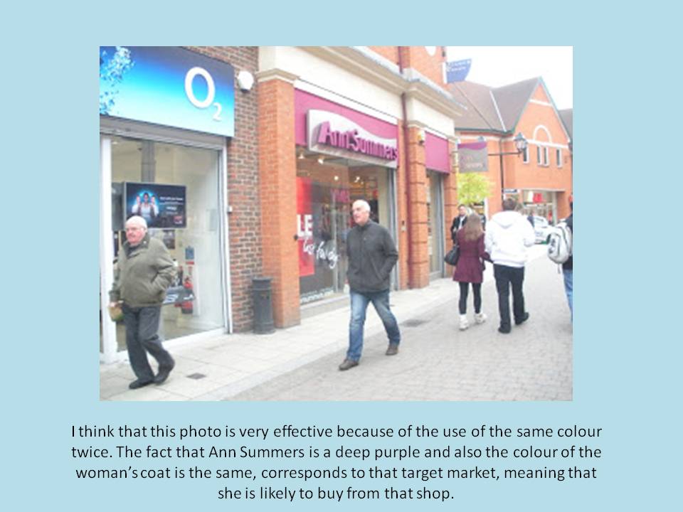

